-
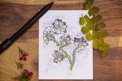
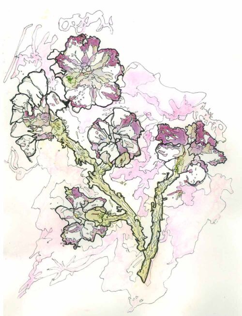 This is one of the artist's favorite pieces. Surprised at how these flowers appear to be pansies when actually they evolved from many multiple layers of red everblooming rose bits and yellow daisies. A balance of positive and negative space, the overall effect is calm and sweet.
 -
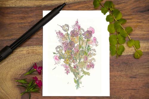
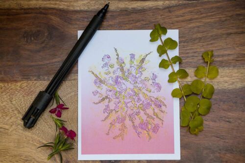
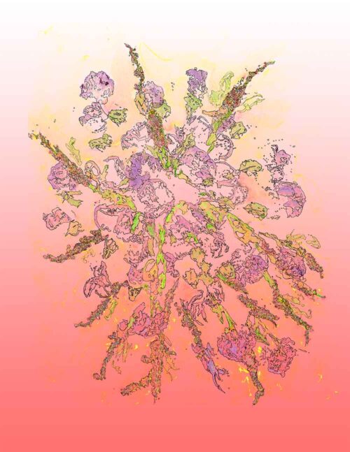
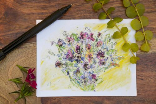
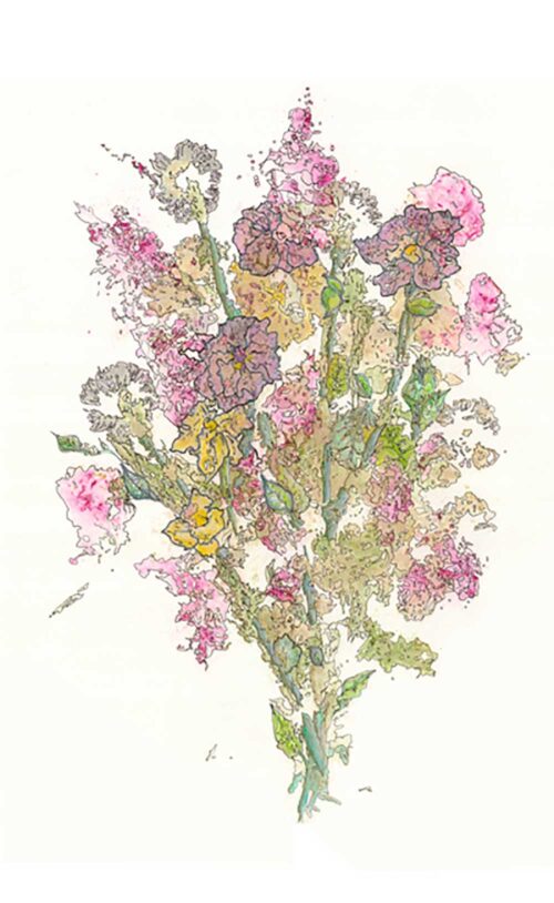 An explosion of color burst out of pounded out flower petals and leaf bits. Multiple layers of carnation, salvia, dianthus, and hydrangea are pounded with a hammer. India ink is used to outline the various color elements on the watercolor paper. Colored pencils further define the stems and leaves to create the sense of this flower bundle.
 -
 This is a very successful version of a piece from the flower abrasion series. It is a scanned version of an original print made with smashed chard and cabbage leaves. The pale blue background complements the almost fluorescent glow of the orange leaves.
 -
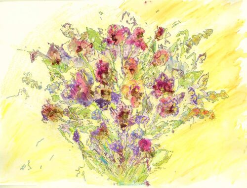
 This piece began with bits of carnation, begonia, lavender, rose petals, and leaves. They were abraded onto watercolor paper with a hammer. India ink made sense of the blobs of color. The original piece was scanned and digitally enhanced with layers of pink, salmon, and yellow creating a romantic cascade.
 -
 This is one of the artist's favorites of the flower abrasion series. It was made by smashing and rolling bits of the red rose petals onto watercolor paper. Fragments of the flowers dried on the paper. Bits of leaves and grasses were abraded as well. India ink sought out form in the midst of the blobs of color. Light watercolor washes were added to allow the sun to push through.
 -
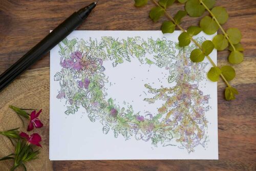
 The purple pigments in this piece are solely derived from the smashing and re-smashing of red everblooming rose bits and their leaves. Abraded stalks from the almond bush are added which create mauve, green, and yellow pigments. The airy feel of the wreath is accomplished with the use implied line and the use of India ink seeking out figure from ground.
 -
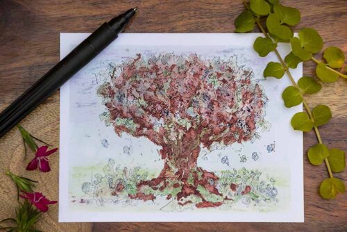
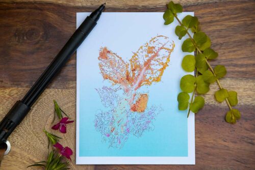
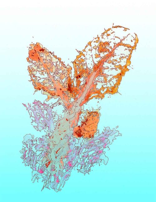
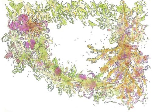
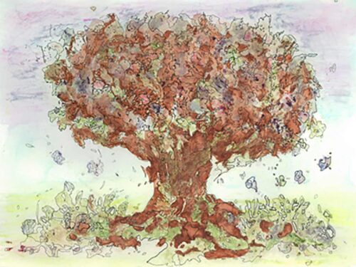 Initially made with pigments from bits of smashed red rose petals that exuded purple pigment, the Tree of Life's layers are outlined and negative space is defined with India ink. A watercolor enhanced design and bright final movement to the piece with a particularly interesting root structure.